


Share the post "We need less toilet paper, sir!"
 |
from Dmitry Joukov,
|
Not long ago I’ve published a story about the creation of icon for “Buy Me a Pie!” in iOS 7 style and the results of our attempts. I was surprised to see the rush of comments under it, and according to their number and the willingness you shared your opinions on the icons the topic turned out to be a matter of interest! The whole “Buy Me a Pie!” team was monitoring the comments closely since everyone was eager to know which icon wins. As a result #1 proved to be Number One, and frankly speaking I expected that. Now I’d like to tell you more about this very icon: why it was made the way it was made.
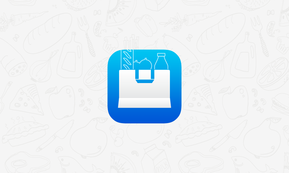
It all began in December 2013, when Sergey Bulaev and Alex Salmov (co-owners of “Buy Me a Pie!”) asked me to draw a new cool icon. The slight tension in the tone of their request made it clear to me that they wanted not just some improvements – the existing variant with the white bag did not satisfy them at all any more. Out of the blue they stopped liking my icon! It took me a week to put up with the fact. I kept on considering my icon acme of perfection - well, at least the acme of conformity with iOS 7 design ideology and current “Buy Me a Pie!” look and feel. Maximal change I was ready to make was removal of the bag bottom widening, which really turned out to be clumsy.
But in a few days I suddenly found myself looking at my icon more critically than ever before. Now it did not seem that perfect to me. Time to make changes came, but first of all I needed to choose the direction to move in:
- improvement of the existing white shopping bag;
- color coding;
- just a colorful catchy icon;
- adapting of “Buy Me a Pie!” icon used in the Android version of the app.
As you know, in “Buy Me a Pie!” we use colors to group products, and in the last version of the app we have improved it a bit by adding hatching to some colors. Most of the products can be found in the default dictionary, where they are already grouped, which is very convenient. This is one of the key features of our application, so why not emphasize it?
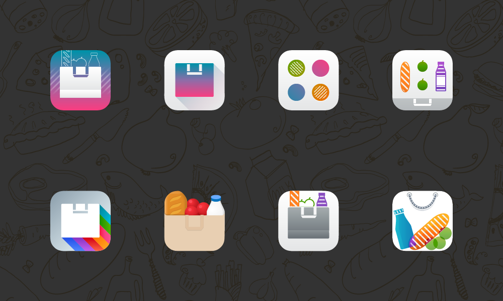
“I’m drawing some crap” — that was what I thought after I draw the variants above. All that deserved to be thrown away – well, maybe except the last one, it was not as bad as the rest. However it was way too fussy. Thus I decided to reduce the number of the selected directions to two:
- color coding;
- just a colorful catchy icon.
By the way, I know several designers who organize the icons on their iPhones screens not by some categories or frequency of usage, but by color (designers, you know). On the one hand it is pretty logical, but on the other hand it makes me believe that icon creators have a rather one-sided view on the style Apple suggested for iOS 7. The idea of making something “flat and single-color” captured the minds of apps and icons designers.
To stand out from competitors one needs to create a vivid image — a successful combination of form and color. This is related not only to the icon — this is what the graphic design in general is based on. In our case a vivid image should be associated with products, shopping, purchases. Abandoning the shopping bag filled with products makes no sense to us, but the set of products should have been updated.
Now let’s turn to statistics. Here are top 10 products purchased in the USA:
- Milk
- Eggs
- Bread
- Bananas
- Butter
- Cheese
- Potatoes
- Onions
- Toilet paper
- Apples
In Russia this list is almost the same.
Of course it is very tempting to select apples and bananas from this list, but fruit have rather complicated forms, so a schematically depicted apple can be taken for a tomato, and I will not dare to mention what a banana may look like. Cheese and butter do not have any expressive neat images in general, and eggs have no canonic package. So, now we can shorten our list and get rid of all the ambiguous staff:
- Milk
- Eggs
- Bread
- Bananas
- Butter
- Cheese
- Potatoes
- Onions
- Toilet paper
- Apples
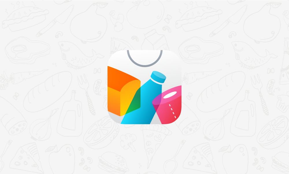
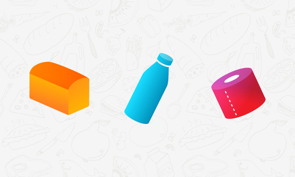
We use one icon for our app all over the world, thus we need to select something absolutely easily recognizable and international. Bread, milk and (!!!) toilet paper.
And here we come to the point of the objects forms selection for these three product, bearing in mind that our main target markets are the USA and Russia.
Milk
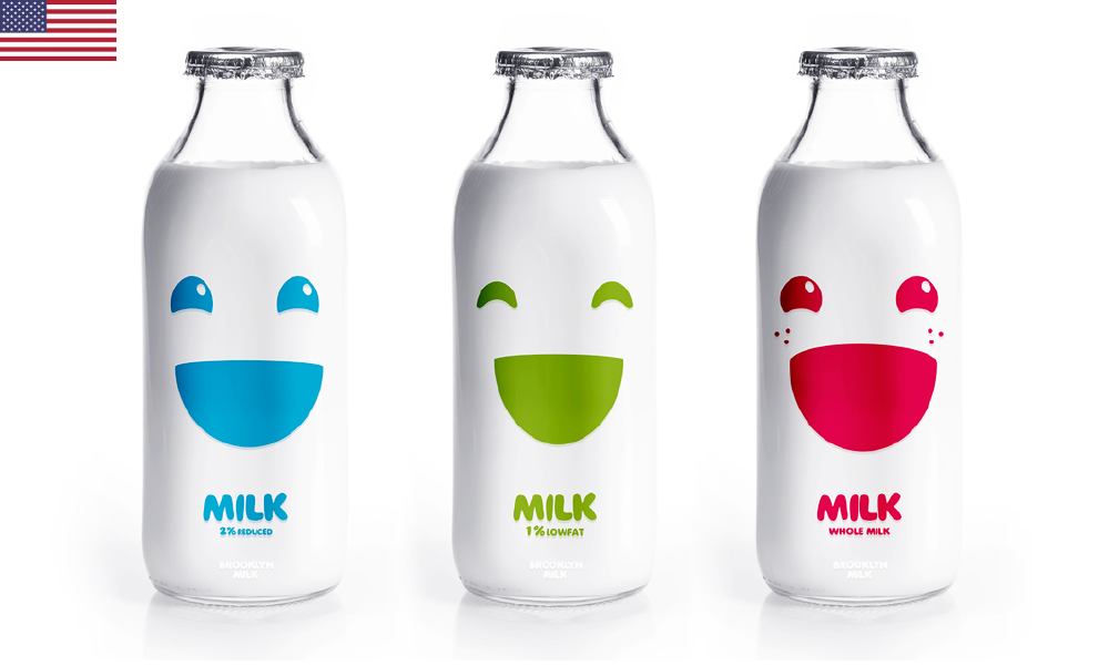
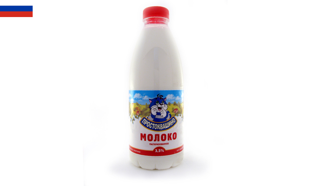
In the Unites States, where the culture of packing is rich, one can find classic milk bottles made of glass. In Russia we have plastic bottles of a similar form. This bottle can be seen on the most well-known “Buy Me a Pie! Classic” icon and was inherited by the Android app icon and white-and-blue icon of “Buy Me a Pie!” designed for iOS 7. So, let’s keep the milk bottle as is.
Bread
If you want to know what long loaves look like in Russia, have a look at the skeuomorphic icon of “Buy Me a Pie! Classic”. That very long loaf was the core symbol of our application. It looked natural for Russia and countries where bread like that is baked. My previous post was followed by multiple requests from Russian customers to return that very long loaf back. But we know that in America and Europe bread is different. Thus we should change the loaf form.
Toilet paper
Fortunately, the object of toilet paper application is the same all over the world, and toilet paper looks approximately the same everywhere – it is a perforated roll.
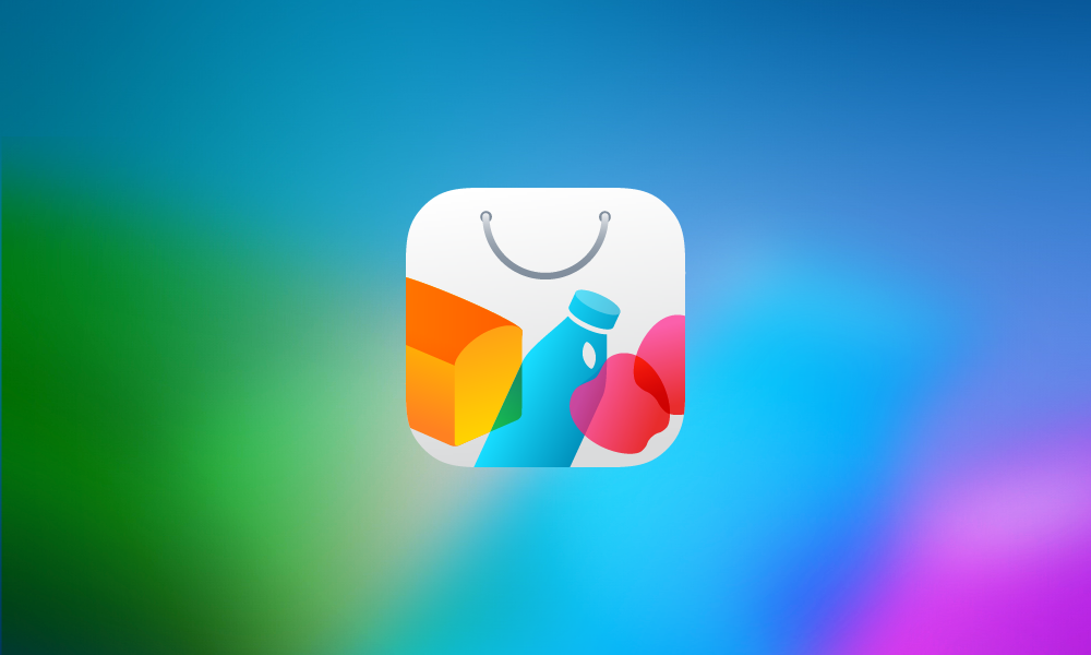
I did not decline the idea of color coding. The multicolor icon should be associated with the variety of purchases and app features. But three colors are not enough for that, we need more colors! So let us put the items on the each other and paint the overlapped areas into different colors. As a result we get not just a vivid catchy image but an icon with the proper set of products. Everyone in “Buy Me a Pie!” team believes it should help us to reach the new tops.

Epilogue
When testing the icons in social nets and reading your comments to my post here and on another Russian site I suddenly found out that toilet paper has unpleasant associations for some users. Moreover, some people feel awkward when they have to buy toilet paper.
At first this awkwardness seemed funny to me, but then followed doubt and concern. This new information and direct feedback from customers let us create a perfect icon for our application.
I hope, nobody is too shy to buy apples? ![]()
Share the post "We need less toilet paper, sir!"
 EN
EN  RU
RU