


Share the post "We need more flat icons for “Buy Me a Pie!”, sir!"
 |
from Dmitry Joukov,
|

App icons have nowadays become extremely important elements of branding, in some cases they take place of company logos. Icon is the major means of contact with the audience in app stores.
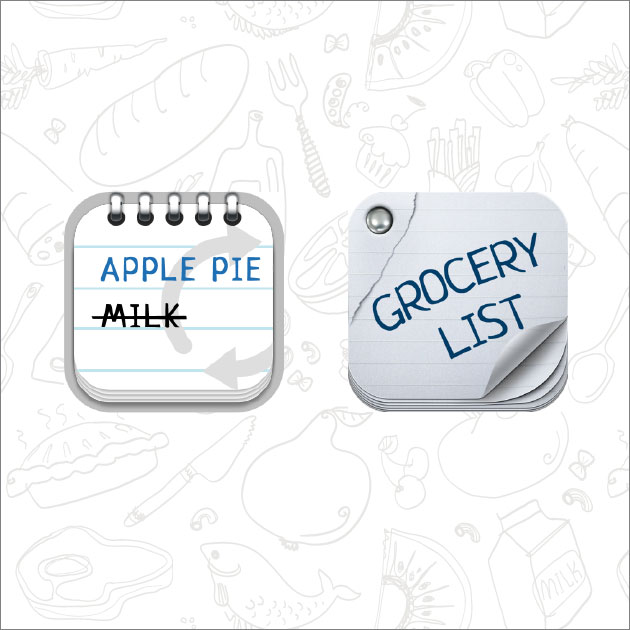
Here are the very first icons of “Buy Me a Pie!”:
The basic format of Apple icon is a square with rounded corners. On the one hand, this provides great opportunities, since any image can be drawn there, but this turned into a real nightmare for old school designers. Everybody was used to depicting some real physical object, not just a square. This limitation, imposed on the super creative and aesthetically gifted developers and designers who sympathize with Apple, brought unbelievable results. Dribbble witnessed a real fight for «The best way to fit a cup/phone/fruit/car into the rounded square».
“Buy Me a Pie!” also took part in that with its famous product bag, that stayed almost the same for three major versions of the app.

All the managers, whose heads are in the clouds and who consider all that to be just designers’ games and waist of managers’ precious time, should face the truth: the new icon made the app more noticeable and recognizable, which in it’s turn significantly increased the sales. According to the users feedbacks, they had an appetite when looking at the icon. The icon was so cool that there appeared many copies and clones of it.
But skeuomorphism era could not last forever, and sir Jonathan Ive smashed this legacy of the past with chivalrous panache. Needless to say, huge amount of users hated the flat and a bit freaky iOS 7 design – but it’s Apple, baby, they can afford it.
As for me, the new design is the very thing that iOS ecosystem needed badly. Everyone who ever tried to make something skeuomorphic understand that this is a dead-end of design, a mindless embellishment. It has certain pros, though — a good illustrator or technical designer can create a beautiful though bad interface, and users will not note the trick.
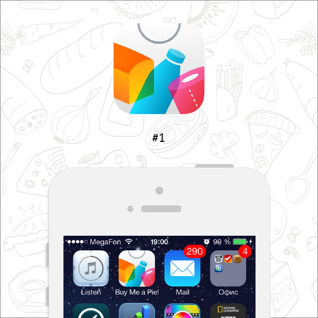
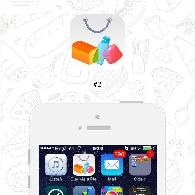
We did our best to escape hyperrealism in version 3 of “Buy Me a Pie! Classic” and simplified all its elements a lot, but not the icon – we did not dare to encroach the sacred symbol that was with us for years. By the release of iOS 7 we designed an absolutely new “Buy Me a Pie!” application from scratch. And this time the changes affected the icon as well – we left only the schematic image of the bag and put a few products into it.

The new “Buy Me a Pie!” icon, as well as iOS 7 in general, did not hit the spot with everybody. Despite of being carefully drawn, the result turned out featureless, with some flaws like the widened bottom edge.

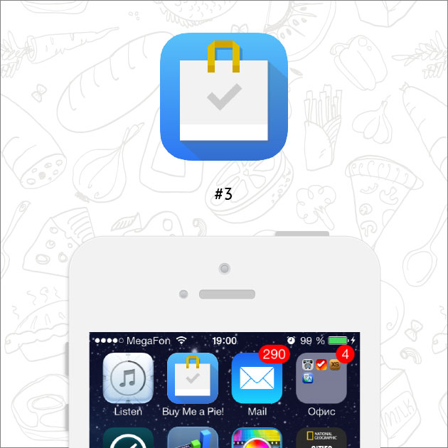
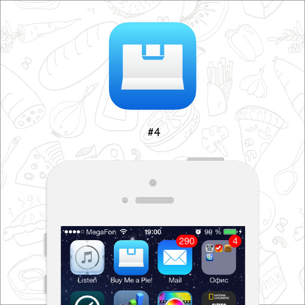
But we are not going to give up – on the contrary, we consider it a good reason to make new icon, the ever best one! Even if you are sure that your icon is perfect, it is most probably not — so experiment, test, try different variants! Here is what we’ve got this time:
Which variant do you like the most and why? Welcome to share your opinion in the comments!
Share the post "We need more flat icons for “Buy Me a Pie!”, sir!"
 EN
EN  RU
RU
Pingback: We need less toilet paper, sir!