We need more flat icons for “Buy Me a Pie!”, sir! 29.01.2014

jukov-e1390894479728

from Dmitry Joukov,
Art Director of  “Buy Me a Pie!” and 5EVEN, Head of Bodybeat

0-en
App icons have nowadays become extremely important elements of branding, in some cases they take place of company logos. Icon is the major means of contact with the audience in app stores.

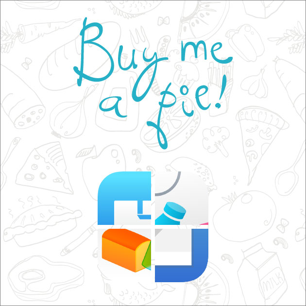
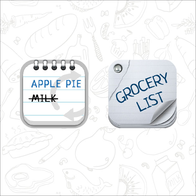
Here are the very first icons of “Buy Me a Pie!”:
1-en

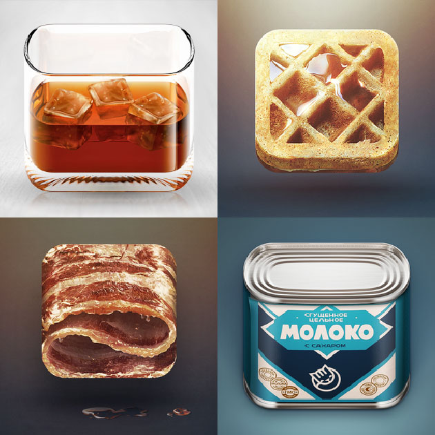
The basic format of Apple icon is a square with rounded corners. On the one hand, this provides great opportunities, since any image can be drawn there, but this turned into a real nightmare for old school designers. Everybody was used to depicting some real physical object, not just a square.  This limitation, imposed on the super creative and aesthetically gifted developers and designers who sympathize with Apple, brought unbelievable results. Dribbble witnessed a real fight for «The best way to fit a cup/phone/fruit/car into the rounded square».
2

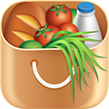
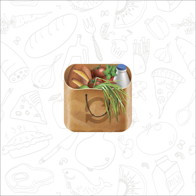
“Buy Me a Pie!” also took part in that with its famous product bag, that stayed almost the same for three major versions of the app.
3 (1)

All the managers, whose heads are in the clouds and who consider all that to be just designers’ games and waist of managers’ precious time, should face the truth: the new icon made the app more noticeable and recognizable, which in it’s turn significantly increased the sales. According to the users feedbacks, they had an appetite when looking at the icon. The icon was so cool that there appeared many copies and clones of it.

But skeuomorphism era could not last forever, and sir Jonathan Ive smashed this legacy of the past with chivalrous panache. Needless to say, huge amount of users hated the flat and a bit freaky iOS 7 design – but it’s Apple, baby, they can afford it.

As for me, the new design is the very thing that iOS ecosystem needed badly. Everyone who ever tried to make something skeuomorphic understand that this is a dead-end of design, a mindless embellishment. It has certain pros, though — a good illustrator or technical designer can create a beautiful though bad interface, and users will not note the trick.

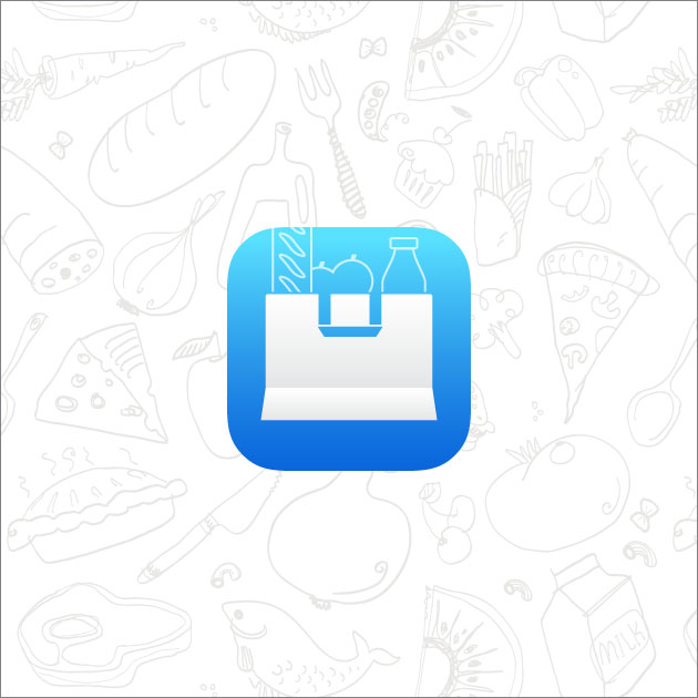
We did our best to escape hyperrealism in version 3 of “Buy Me a Pie! Classic” and simplified all its elements a lot, but not the icon – we did not dare to encroach the sacred symbol that was with us for years. By the release of iOS 7 we designed an absolutely new “Buy Me a Pie!” application from scratch. And this time the changes affected the icon as well – we left only the schematic image of the bag and put a few products into it.
4

The new “Buy Me a Pie!” icon, as well as iOS 7 in general, did not hit the spot with everybody. Despite of being carefully drawn, the result turned out featureless, with some flaws like the widened bottom edge.

Screen Shot 2014-01-28 at 5.31.33 PM

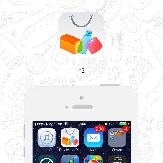
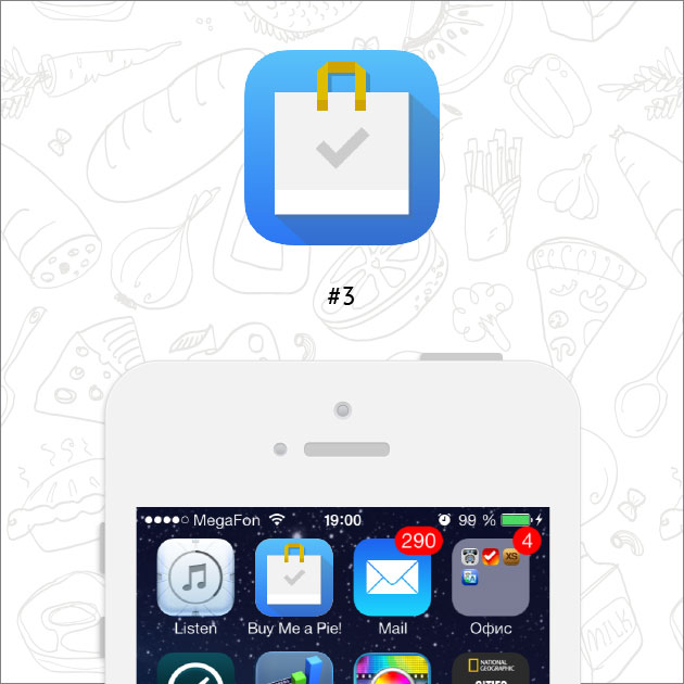
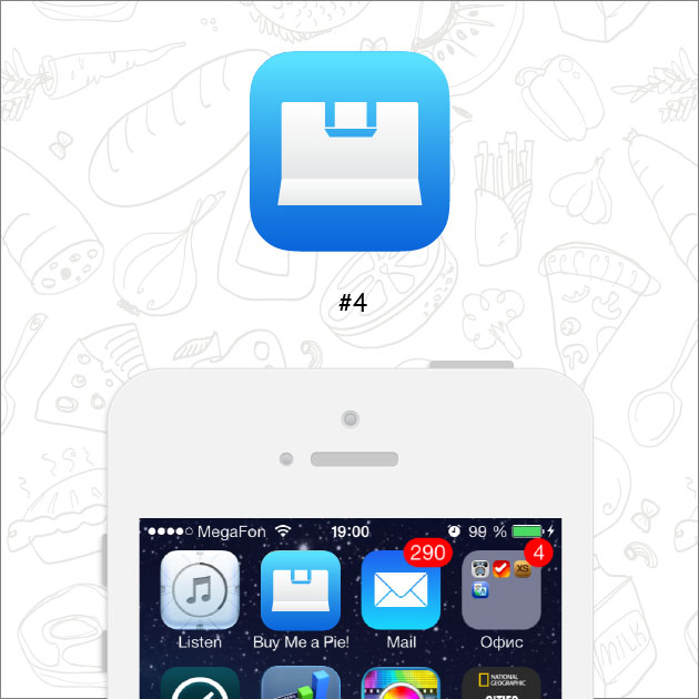
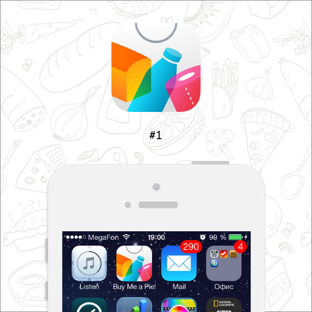
But we are not going to give up – on the contrary, we consider it a good reason to make new icon, the ever best one! Even if you are sure that your icon is perfect, it is most probably not —  so experiment, test, try different variants! Here is what we’ve got this time:
6_1-en

6_2-en

6_3-en

6_4-en

Which variant do you like the most and why? Welcome to share your opinion in the comments!

Download “Buy Me a Pie! – Grocery Shopping List”

Download “Buy Me a Pie!Free – Grocery Shopping List”


Related posts:

  • Marius Jacobsen Eggerud

    #1

  • Lori S.

    Number 2, but replace the toilet paper with a food item. Toilet paper does not have appetizing associations. I would go back to using a tomato instead!

    Number 1 is too busy looking. It needs the extra white space that #2 has.

    Versions 3 and 4 are too minimal for my taste, but between those two, I prefer 3. That little touch of gold, the subtle shadow, and the check mark make the icon more distinct from other icons, and easier to spot on a busy screen. #4 is just too similar to the Mail icon. (If you have to go with 3 or 4, that is – #2 is still the best. Well, actually, skeuomorphic or not, the early product bag icon is the best!)

    • Tony DiTirro

      It might be paper towels.

  • loyal user

    Number 2. It stands out better than the basic blue. The current one is hard to find amongst all the other icons.

  • whitehorus

    I would prefer the second style, as the products can be seen in total.
    But with the flat design of the handle from icon #1.
    To replace the paper roll with a tomato (as Lori already mentioned) seems to be a good idea.

  • Mhoutman

    1 clen, clear and woth a message

  • Dmitry

    I like #1 and #3

  • A Cat

    #1
    I would avoid red colored items, because red in icons is the “warning” color; I’d prefer a green piece of veggies in place of toilet paper.

  • Vaso C.

    As a UI designer i prefer #3. I think #2 looks too busy!

  • pagocs

    Sorry to say, but I guess none are enough groundbreaking yet.
    But from the choices I vote to #2, but – in agreement with some previous comments – I also would like to suggest to replace the red toilet paper.

  • John Doe

    I am in for no. 2 especially if you look at its presence on the iOS7 summer board. Change the toilet paper for some green lettuce. Also add icon badge feature to the IOS7 version. The red icon badge will look great on no. 2 !

    No. 3 is all about a today app and too general. No 1 is not very subtile. N0 4 is too much like the current.

    Last but not least I would post this on dribbble where you perhaps get some more professional feedback :)

  • Kenneth

    #3

  • Tina

    №1

  • Tim

    I no 1 the most. Like the colors and arrangement of the things.

  • Benni ;D

    number 2 :D

  • Gabriel

    I don’t think any of them is really a step forward. Sorry.

  • Patricia

    #2 without the toilet paper, please

  • Kathleen Greenway

    I like number 2 the best, number 1 second best. The shopping bag ones don’t appeal at all. i know you are not asking me this but actually I dislike the name of the app too- though i like what it does…hence i have it. I think it has too many chauvinist connotations..eg ‘oi wife ..buy me a pie’

  • Magga

    Nr. 2 is ok but could be a little more organic/realistic.. I liked the brown produce bag.

  • xxx

    I actually like the original icon best =-( I loved the brown paper bag with the green veggies and bread etc… If I had to pick a new one I would pick #2 but I really don’t like the toilet paper. Also I don’t care for the minimalist look they all seem to have. I also have to say that it is a little annoying when a an apps icon changes so much that you can’t find it on a device.

  • KEGS

    #1 is definitely the most eye-catching icon.

  • arthur

    none of the 4 are appealing

  • http://williesite.tk/ Will Persampieri

    #1, the extra white space in #2 isn’t needed

  • Juan Cruz

    Hi Dimitri,

    Super fun idea to share this with us your user/fans

    I Vote for #1.

    But if you have a rolodex of ideas random web people suggest, you can add this one:
    How about a pie made of all the other objects (bread, milk, tp).
    That is (to us) the genius of your name. Making everyday chores sound fun. Camouflaging the chores.

    Myself, my wife and others (that we have evangelized with your app) love the name.
    My wife is now using it to practice he Spanish while Shopping.

    Best of luck!

  • Moses

    #3

  • iGerri

    I prefer the 2. icon but without the toilet paper. I propose a food item.

  • Donna Lowe

    #2 with the change of the toilet paper or the addition of green veggies ( althoughI like the size of the items in #1 soo you probably could add some celery )

  • Gali

    #2 but, please, change a toilet paper!

  • hg

    None of these designs is very appealing. The old one is probably the best

  • James Humphrey

    Number 1. The colors are very appealing. The aspect of the new design I didn’t care for the most, is the color blue. Now, I like that color. Only, so many iOS icons have that hue. Many are red as well. For it to stand out amongst the other millions (billions?) of apps, a distinct color is necessary. Also, the ultra thin line work was an imbalance when compared to the bulk of the shopping bag. Thanks for inviting us to contribute! I love the app and use it all the time.

  • Andrew Wood

    Definitely 1 or 2. I have so many flat blue icons on my homepage (facebook, skype, Tweetbot etc) that they’re becoming idfficult to distinguish at a glance – surely the point of an icon?

  • Mathias

    #1 and let the toilet paper in… Great idea!

  • pl

    Number 2

  • LauraB

    #1

  • Alnig

    Number 2!
    Please don’t choose another blue icon. There are far to much on my homescreen already.
    I don’t care if it’s toilet paper or a tomato. I used to buy both of it sometimes and forgetting the tomato is less hard then forgetting the toilet paper :-)

  • Martin Baeck

    #1 is #1 with me.

  • Ide

    #1 is great!

  • Gary

    #2 but swap out the TP for something else (how about a slice of pie). I know you didn’t ask, but I’ll volunteer this anyway, but “Buy Me A Pie!” does nothing for me, I don’t get it. Nothing in that name implies to me what the app is and why I should buy it. When I’m heading off to the store, I get requests like “buy me Pop Tarts” or “buy me a pizza” or “buy me a 6-pack”. But I’ve never had anyone in my family say “Buy me a pie”.

  • Carlos

    I really liked the simplicity of Number 3, but seeing it next to other icons, it would get totally lost. My vote is for number 1. Or for more options… :)

  • browningm77

    #1, and I agree with others about trading the toilet paper for a pink/orange food item.

  • http://sergeax.livejournal.com/ Сергей Аксёнов

    Для меня приложение – про товары, которые надо купить. Этому назначению соответствует только одна иконка №1, все остальные – про сумки и пакеты :)

  • Plymouth51

    I like the look of #1, but since I use multiple lists, and not all are for groceries, I would vote for #3.

  • Joan C

    I prefer #1 because I look for icon by color first. Dump the TP in favor of green veggie and make that more prominent. Subliminal messages matter.

  • Priscilla Raider

    I do not like 3 & 4 at all. I don’t like the color scheme of any of the choices. They are all too cold and sterile.

  • Stuart

    Number 3 is my favourite. It’s simple, OS 7 like but a bit more interesting than the current icon.

  • kabDAD

    Something besides the weird neon colors. Design #3 looks good and depicts the apps function well, the shaded neon color is just kind of ugly. Why did iOS do this?

  • Jackie

    #1 Because its colorful! I like color, its more fun.

  • Val

    I like number 2 best because it reflects what “buy me a pie” is: a grocery list. However, I’d switch the toilet paper roll with a tomato, carrot, or banana.

  • she

    Number 3. It’s simple and brings a paper bag to mind – very eco! ;)
    I don’t like the toilet paper on #1 and #2 :)

  • Informatikus

    #1

  • Michèl Passin

    #1, but I think Lori is right by saying replace the toiletpaper. And I dont like the overlay of the items.

  • Pattmyn

    #2′s got my vote

  • ιηɠσ

    definitely #1

  • Toni Matlock

    I like #3 the for it’s simplicity and clear message – checking a list combined with a shopping bag but it might be too plain to stand out among other icons. But I also suspect more users will respond to #2 because it is colorful, still conveys the point and is easier to find among other icons. That’s the real trick isn’t it? #1 does this as well with more abstraction.

  • DP

    I think #1 stands out the best and conveys the proper meaning of the app.

  • Craig Yager

    Skimming through the pages on my iPhone, I
    quickly spot those icons with only two colors and simple shapes or branded
    symbols. Everything else is a blur of “too much.”

    This is the iOS 7 world. Look up the following icons as examples of
    easy-to-spot:

    Dropbox, Mail, Phone, Messages, Messenger, Music, Specifics,
    Coursera, WeightWatchers, Circa, Facebook, iBooks, Skype, OmniFocus, Groupon,
    My Verizon, Pandora, Evernote, App Store, Target, Chase.

    Buy Me a Pie icon #4 fits within the category of those that are
    easily-spotted and recognized.

    As a historical link to the very popular product bag icon that we
    used for so long, I would recommend, rather than the blue background with the
    white bag, shifting the background to a shade of brown used in the old icon.

    btw, thanks for asking…

  • Ericalynn Arnold

    I like #1 and #2 the best. In that order.

  • Milo Grika

    #4; it’s very iOS 7. Application icons do not stay constant, but change with the times. #4 embodies the clean, simplicity of iOS 7 and the style of today’s computer operating systems in general.

    It won’t, nay can’t, stay the same forever, so use one that reflects the current style direction and live for the moment.

  • Sylvia A

    #2. I agree that the toilet paper should be replaced with an easily recognized food item, like lettuce or broccoli.I didn’t choose the others because the items in #1 are too big and #s 3 & 4 are too minimalist and generic.

  • AZ

    #1

  • Mary

    Number 2 clear and easy says what it means a shopping basket with bright vibrant colours easy recognizable

  • Jan

    #2. It is colorful and self explanitory.

  • Brandon Mullin

    Good Icons have a meaning that implies there underlying function. #1 Says “Joyous Shopping” – It doesn’t imply “List” or “Easy List Making” functions and the red toilet paper roll is disturbing for an icon on a main screen. #2 Is better at implying “bag of Joyous Shopping Items” but doesn’t work for the exact same reasons that made #1 not a good option. #3 Says “Bag of Todo’s” and not even “Bag of Items”, it doesn’t describe your apps function at all. #4 Says “Empty Bag” but does have the fold that implies “compactness” or “efficiency” but doesn’t says what your apps function is. I like your new that you already have in look look because is implies “Shopping done efficiently” but is just missing the “List” aspect. You should just make the bag bigger, remove the Line Art Items from the top and move them inside the bag (similar to the look of your apps background) and integrate a bolder Line Art Pencil over top the bag at an angle such it would imply a “List” being written.

  • tinydesignstudio

    #4 – clean, simple and easily recognizable.

  • cm333

    I’m not that into the old icon, so I was excited to see the new ideas… Unfortunately, I’m not a fan of any of these new ones either. But I do love the app! :)

  • aprudy

    I am with most here, I prefer #2 – it is very clear what it is and distinct from almost all other icons – and would fairly happily fall back on the minimalism made distinct by the gold handle of #3. I think #3 could be improved by making the check mark green, keeping the minimalism but increasing the distinctiveness.

  • Stepan Shatkovski

    I would definitely not choose numbers 3 and 4 because there are already too many blue icons on iOS 7.
    Between 1 and 2 I think the best variant for iPhone will be number 1 because on small iPhone screen the bigger picture will be more recognizable.
    In addition to that I am not agree with other comments about toilet paper. People use this program not only to buy food but also for other stuff (such as toilet paper).

    #1

  • MJS

    #2 with lettuce instead of the toilet paper – green and round will balance out the logo nicely.. My second choice is #3. I’m glad you are updating the logo.

  • cippolino

    I vote number 1. that’s the clearest and most attractive. I like the hint to the shape of the icon as a shopping bag, without being too obvious as in #2. i wouldn’t leave behind the reference to grocery items like in #3 and #4, because they convey the meaning better than the simple shopping bag.

  • nancy

    I like the 2 best. Se can see it easier. I also would change the TP.

  • sami64

    I can’t find the new “flat icon.” I looks too much like other blue icons. Needs color and an image that represents the app. I see the difference between I and 2 and I think they are both effective icons. This flat icon trend that has been forced on us after Jobs died isn’t please or helpful to me. Don’t like it. The old icon did what an icon is supposed to do. Represent the app and make it easy to spot. Change for change sake is self indulgent on the part of the OS designers at apple. I hope it goes away.

  • Mirko

    I’m a user, no designer in any way, but I prefer number 2 or 3 as both show very clearly “what’s inside”. :-)

  • Stu

    #1

  • Amy

    I like #1 or #2, but very much dislike #3 and #4. The first two are colorful enough to help me to find them, while the other two seem boring and look very much like the Mail icon next to it. It would get VERY annoying to try to be going for your email, which most people do quite often, and then accidentally hit the Grocery app. Don’t get me wrong, I really love this app, but I want to open it only when I need it.

  • Pietro

    #2 because it looks the least like Apple ;)

    I hate Apple, especially the Icons with its forced backgrounds! Why every Icon must have the same Outline? So it’s harder to see the difference between many Apps compared to the Android standard way!

  • Judy Plapinger

    I like 2 because it’s pretty. I think the negative reactions here to the TP roll are funny. Lettuce is more appealing? I like the roll. The 3 shapes are complimentary. It’s an icon: are you really going to think about toilet paper use as you press it? And no one’s mentioned the smiley face handle. It’s endearing!

  • Jane Burton

    #1 by far – looks really cool

  • Nick McMurray

    #1 followed by #2, handles could use some work on either. #3 and #4 are way too generic. The toilet paper icon doesn’t really bother me, but I’m all for swapping it out per previous suggestions.

  • db

    I prefer the second. Ives is badly deluded. Limiting detail only makes phones & apps harder to use.

  • Luje

    #2, but lose the toilet paper.

  • db

    The undifferentiated handle in #1 makes that icon look like a t-shirt. Use #2 but replace TP with a green veggie. TP is not red & the name of the game is for us to instantly know what we are looking at.

    The fact that we are having to have this discussion is SAD. Skewmorphism was like life & as our eyes & brains work naturally. This flat style is as if Jonathan Ives has imposed macular degeneration on all of us. If creating a puzzle is the purpose, why not identify icons / programs with signal flags or smoke signals??

    Too bad Apple didn’t have any real work to do. It has forgotten the cardinal design rule: “Form follows function.”

  • Sarah

    I like number 2, as it most closely shows what the app is for.

  • Olaf Winter

    Number 2

  • DGRNFA

    number two is best, different from the white email logo, and the one with the check mark looks like a Nike logo

  • Mia

    I like #1

  • Natalie Cross

    I like #1 the best.

  • Ben

    Number #2

  • Maggie

    Number 1 ONLY. Though I agree that you should replace a toilet paper with a veggie, fish and milk bottle. Thanks for asking for my input, my husband and I really enjoy your app.

  • Tanya Parent

    #2 is my vote. :)

    Love the app, I currently have 6 lists, 1 for each store I shop at.

  • Akgiffney

    #1 or #2

  • http://www.shasam.net Shane Lord

    I’m for #2 with the handle from #1 – toilet paper can be changed or not for something else.

  • Richard Welter

    I like the bag holes at the ends of the handle in number 2, but with the larger items from number 1. Mix those 2 up.

  • Shop Easy

    I prefer #4 as it is the cleanest, flattest, less fussy, simplest of them all. The minimalist look is what a like most.

  • Mike Corsten

    Number 1 for me, hands down my fave

  • Paul Cooper

    Number 2 appeals to me too but I can’t say it bothers me what items it shows. I use the app for buying other things so the loo roll is fine. It’s far better than the current design!

  • Pit

    #1 by far

  • Alex

    I prefer #2. First seems a T-shirt….

  • Dylan Hamilton-Foster

    #3 looks the best to me. PS – in your post you used the wrong word – it’s WASTE of time not WAIST of time.. tsk tsk :-P .. sorry that just jumped out at me when I read the post.

  • Bart

    #2

  • Sheri

    I like numbers 1 and 2 equally. There is something about their transparency that makes them easier to find on a screen loaded with boring icons.

  • maiksmo

    #1, what else :-)

  • DizzyButterflys

    Number 2 is my favorite

  • Bob Durie

    My favorite theme is actually the one in the article with the bag and the stuff in it. I’d merge it with #2, make the bag just a white outline (ie translucent), and keep the colors of the items (doing the TP replacement for lettuce or broc).

    The white background of #1 and #2 just doesn’t do it for me, and the strap at the top indicating a bag seems weird. As-is #2 is my favorite because #3 and #4 have no character, and #1 is a bit too cluttered (but its close).

  • Vishal

    Number one, since it’s more visually appealing.

  • Ted Pinkert

    I like #1 or #2. I think it DOES need a non-food item, but not TP.

  • Daniel Renaud

    no 2, but without the toilet paper!

  • Connie St Laurent

    I like #2 as well, and agree with replacing the toliet paper with a tomato. Its colorful and eye catching. The others are too plain and don’t stand out!

  • Randy Kaempen

    I like number 2, but the handle looks like a smile. It would be better with the items from #2 in the bag from #3.

  • Victoria

    I vote for #1 or #2, and agree with replacing the roll of toilet paper with something else.

  • Topher

    #2. t replace the ass wipe with a piece of pie( buy me a pie haha). White background makes the colorful food icons pop against most cel wallpapers

  • Linsay Whitehead

    #1

  • Joe

    I prefer #2, as it shows a grocery bag and it’s very clear that that is what it is. You can see the full “handle” for the bag, along with the items in it.

  • Anne

    I liked the original icon with the brown bag as well. Second would be #2 with green lettuce and red tomato instead of toilet paper. Or stick to primary colors and have a blue, yellow and red item in the bag. Green can be added too, but nothing more.

  • Sharon L Swift

    Number 1 or 3. The check mark shows up easily on 3. The 1st is more colorful. I like the idea of using a tomato instead of the TP.

  • Tony DiTirro

    Number 1. I like all the color.

  • Janet

    I like #1 the best, and agree with others that a green veggie should replace the red toilet paper. #2 has too much white space and the grocery items are too small. I don’t care for the current icon or #3 and #4 above – they don’t stand out from other icons on phone screens. I liked the brown paper bag icon a lot. Thank you for all your good work!

  • Anna

    Number 2 is very attractive. It’s easy to distinguish and the reason I prefer it over number 1 is because it looks like the products are actually inside the white square bag and they’re not just pictures. That to me represents a shopping list app better than anything else. But I agree with other commenters in that you should probably replace the red toilet paper with something green.
    Icons number 3 and 4 are a complete no-no in my opinion. They look too bland and empty (especially number 4). They don’t help create a brand image.

  • veta

    I like number 1 or 2 better than the others. They’re easier to tell apart from the mail icon which, as you can see, is pretty similar to the icons you’ve come up with in #3 and 4. With the icon as it is now, I tend to hesitate when I’m looking for it, so I’ve moved it into my main menu so I can find it easier. The blue is just too similar to other apps and makes it hard to see.

    The only thing I DON’T like about 1 and 2 is the bag handle. Maybe get rid of it altogether and just use more food items. I use Buy Me a Pie for ALL my lists, not just grocery, so I don’t necessarily relate it to grocery bags.

  • Ali

    I like #2. Its colourful, like the bag style, a little different, but replace the dunny roll with a pie, after all the app name is buy me a pie! The others are to plain and boring.

  • Lili

    #1, it is more eye catching , but yeah I agree, replace toilet paper

  • Jenni

    #1 the blow up of the products and the pop of colour is very noticeable.

  • xellos

    №1

  • twiz999

    #3….because it says what it is if you’re just browsing the app store looking at icons first, and descriptions second…. Basically it says ‘it’s stuff you tick off when you put them in your bag’.

    Though maybe make the ‘tick’ a little bolder.

    I hope this helps.

  • Gio

    Number 3

  • mike

    I like #2. The primary reason is the attention getting colors. The design with the handle(detail)/smile is eye catching, and that helps when accessing the App on the screen. When I go shopping at the grocery store, it’s usually for bread, milk and bananas. Perhaps the bread could be light brown, the bottle is good at blue (for cold), and then the banana could be yellow.

  • Stacey Letner Miller

    Number 1 easier to see the details

  • Susan Tymchuk

    I actually like the icon you already have BUT if I had to pick it would be #2.

  • Chris Colden

    I’m an android user but I’m guessing this will appear in time also. Therefore I’m choosing #1 for simplicity and differentiation from other icons for other apps.

    Regards
    Chris

  • Chris Colden

    I’m an android user, but i would choose icon 1 or 2 for their simplicity and differentiation other app icons. The others are similar to certain task list icons. Also why is there not the obvious pie in the Icon. It is buy me a pie after all.

  • Lasixxx

    #3 for sure!
    I don’t like the the colors of #1 and #2.

  • Graafisk Design

    I agree with many: #2 but switch the toilet/towel roll for a veggie/fruit. The gel colors overlapping are a nice touch! The shopping bag variants blend-in too much; #2 stands out.

  • Debby Bridges Henning

    I like #2 because it is colorful and still lets you know its a shopping app. #3 and #4 look too much like a folded briefcase.

  • Stefan Nielsen

    I like 2 best.
    1 looks a liitle bit skeuomorphistic to me.

    Great App!!!!

  • Toni

    I like #2 as it’s colourful and appealing to the eye and will be easier to find amongst my apps.

  • Patrick

    Number 4

  • NIFFI

    #3 is the best! it suits the iOS7 design well. It es Simple, easy to find and recognize!

    Isn’t the #4 just a upside down version of the Mail icon? That would be just poor.

  • Tait

    #1. #3 and #4 are too generic.

  • kyrieanna

    make it colorful! there are far too many blue + white app icons. twitter, facebook, weather, asana, mail, my bank app…..

  • mike jones

    #3 is my pick.

  • victor delgado

    number #2

  • Pam

    I don’t like any of the new choices. They all seem too plain and boring. I prefer the one I have now, which is the “famous product bag”. It’s colorful, cute and stands out more.

  • LT

    I like #3 the best. It is more interesting than #4 but not as “busy” as #1 and #2. I have only purchased two apps that didn’t come with my phone and my home screen is already too cluttered. Therefore, I don’t want another “busy” print. I prefer simple icons.

  • Tim Marsh

    #2 Please. It stands out well from other icons. I find the current blue icon hard to find on my screen. As others have mentioned maybe swap toilet paper for something else, maybe something other than Grocery as I use ‘Buy Me a Pie’ for other lists too like the hardware store.

  • Pingback: We need less toilet paper, sir!

  • Shaiya Rox